| OUR LIBRARY, 2008-2010 |
| FRONT AREA |
|
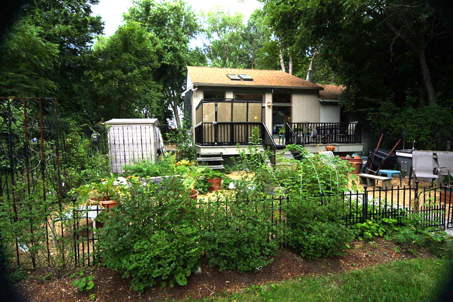
Entrance to the library is through an herb garden and a partially screened deck. Tall trellis pieces are tied together with black
plastic wire ties to form a fence on which honeysuckle grows. The low front fence will eventually be hidden by the lilac bushes.
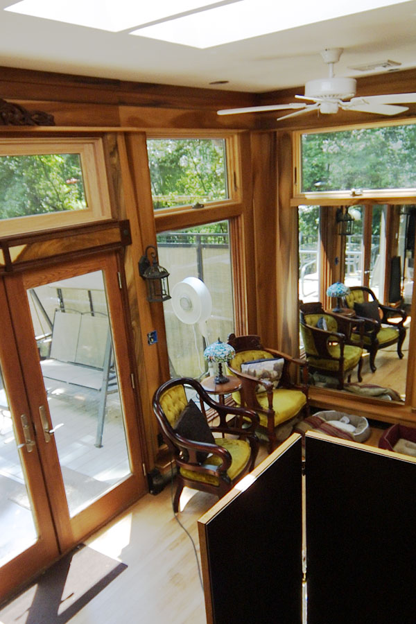
This small sitting area in the front of the library is clearly visible from the street. An outdoor set of privacy screens on one side of the deck gives some privacy
to the indoor area. Short, horizontal windows pull the walls together and allow for decorative ledges near the ceiling.
Where there are no windows, there are mirrors to enlarge the area and reflect the outdoors and the library shelves.
Light appearing furniture, like the glass display case to the right of the closet doors, opens up the area, as do the mirrored screens behind it, which
imitate the framed mirrors. The mirrored niche at the rear juts out from the building to give space without taking away from the
small interior. A large mirror at the corner reflects the windows without providing a view of the neighboring house. The large mirror sits opposite the
mirrored door which opens from the main house hallway into the library.
Lighting consists of recessed fixtures meant to be unobtrusive, stained glass for atmosphere, and outdoor lanterns framing the French front doors,
used to blend the indoor/outdoor space.
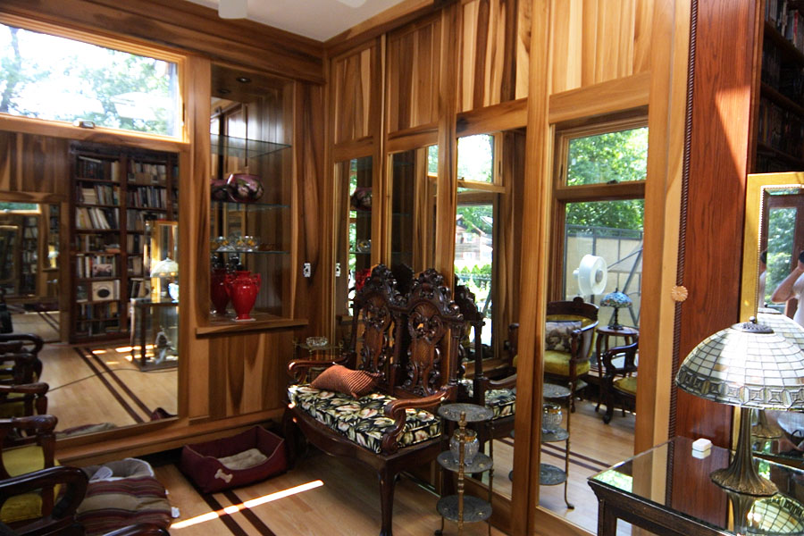
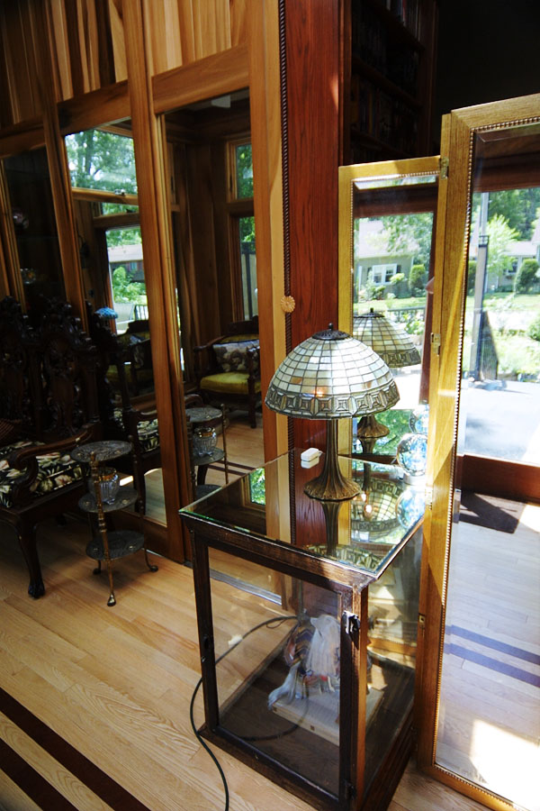
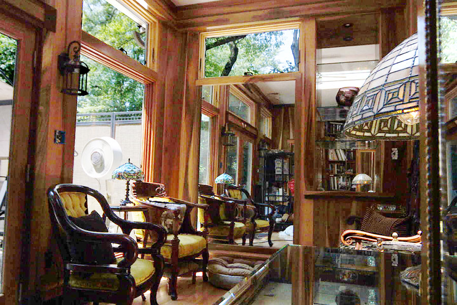
The purpose of the 10' high closet on the
right is to keep private the office area behind the closet. The closets take clear storage boxes, end on, since we're
always desperate for storage. The doors of the closet are sliding mirrors to reflect the views through the windows.
Because we were balked at finding 10' high mirrored doors, we had to make our own.
The floor for this front area is natural oak, decorated with two dark strips that further connect the front area
to the office middle.
One of the important aspects of the design of this room was to eliminate the terms "window frame" and "door frame" and
see the design as only horizontals and verticals. This lets the different parts of the room flow more dynamically together.
Repetition was also a priority. The carved design above the French doors echo the carved walnut bench in the front sitting area
and the carved top of the bookcase wall armoir. The black cast iron of the lamps echo the roundel notched into the walnut
blocks ending the crosspieces of wood between the top window and French doors. Those roundels are repeated in the knobs on
cabinet and closet doors, and the lanterns are repeated in the bathroom.
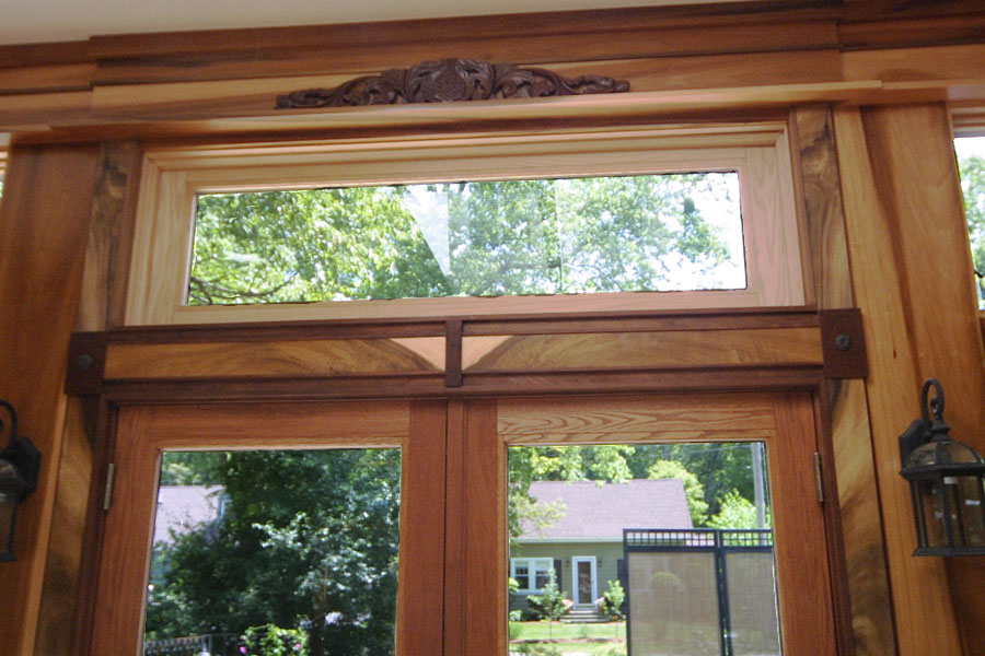

All of the brightly colored poplar was saved for this area,
and the finished boards were numbered in preparation for being placed in their proper positions on the walls.
In order to maintain the color of the boards, the boards were finished with waxfree shellac, followed by a single coat
of Minwax pecan polyshade, followed by a coat of oil based polyurethane. 600 sandpaper leaves a glassy surface.
Finding colored poplar was an adventure. They seem to be considered rejects and were always at the rear of
lumber piles in Lowes and Home Depot. The high quality lumber yard we also frequented didn't have any at all. Luckily,
the stores were marvelous about having someone take out all the boards and let me handpick for color and grain. There was
a constant turnover of wood in our home woodpile to make sure that we had only the highest quality boards from which to work.
The most impressive boards were left unstained and only finished with waxfree shellac and polyurethane. To get the most
out of them, they were ripped to produce two very thin boards that were then glued to appropriate depth boards to form normal 3/4 inch ones.
Where the gluing would show, decorative trim, in walnut or dark poplar, hid the layering. All walnut pieces were finished
traditionally with orange shellac.
For walls, the boards were tongue and grooved. Where the boards were up high and it wouldn't be so obvious, boards were beveled,
and then biscuit-joined together to form walls over a door, or the top of the sliding closet doors.
|
| BOOKCASE WALL AND OFFICE AREA |
|
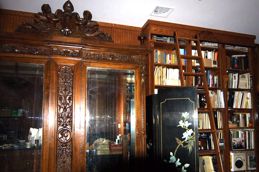
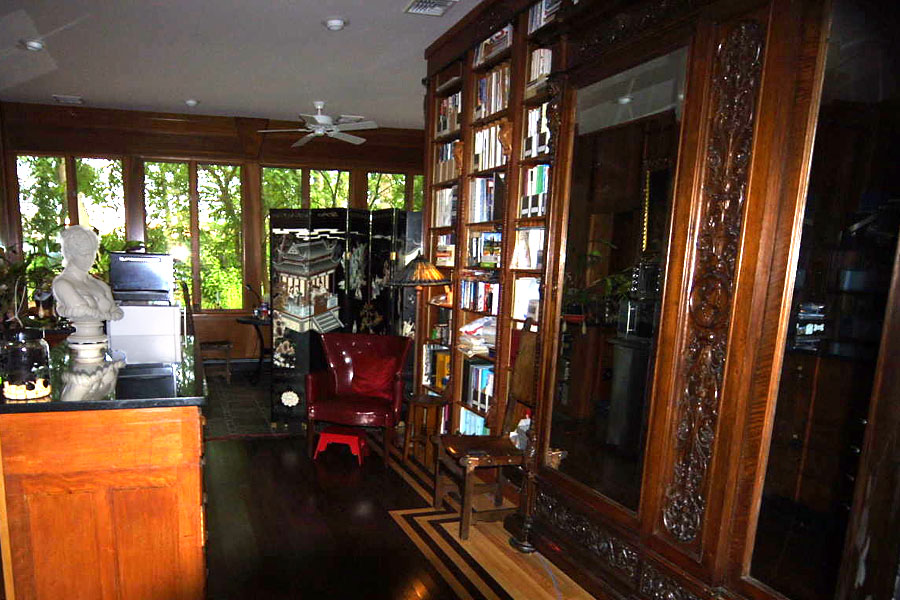
The movable library ladder is stored at the first set of bookshelves before you pass the 10' high, carved and mirrored 7' wide armoire.
Where the front sitting area was natural oak laid parallel to the front of the house, the office area has a dark floor with a
natural border that echoes the shape of the armoir, and runs parallel to the side of the house. The two stripes continue from
the office area through the sitting area, connecting together the change of color and direction.
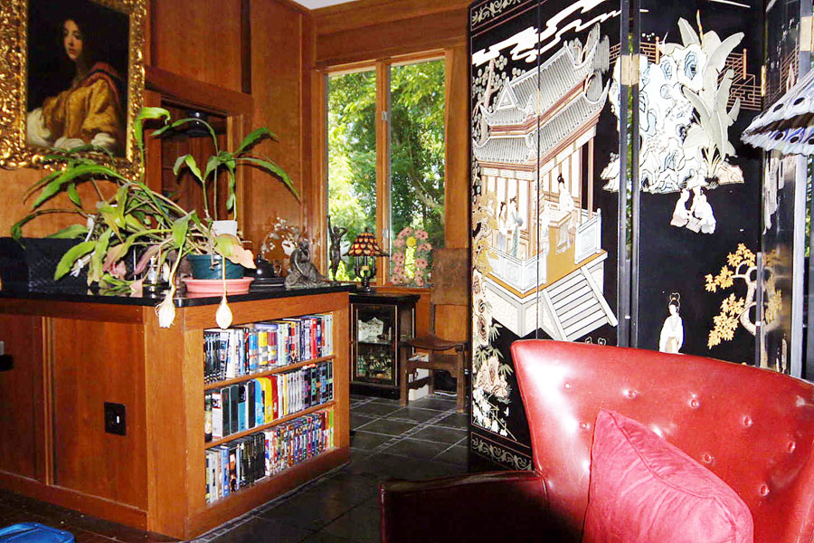
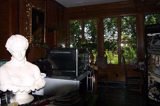
In order not to block the front window views with curtains or shades, privacy was obtained with moveable indoor screens. By alternating and staggering their placement left
and right of the main room corridor, from the front to the rear, it was possible to block visibility into the room from the street, while still having
open space above the screens.
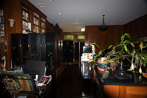
Looking from the back to the front
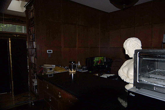
The office area is relatively small, and is delimited by the absolute black granite-topped apothecary cabinet. The walls
are birch panels trimmed with poplar. This was my first time working with woods whose grain became muddied through
the simple act of staining. It wasn't until we moved off this wall that I learned how to maintain the plywood panel grain
with waxfree shellac. As a result, the walls look more like leather than beautifully grained wood. And, wonderfully, it works.
We've always had Paul's desks made since he prefers sitting lower and wants his computer to sit deep, so we had butcher-blocked
oak made into our favorite desk shape, which is a simple top held by two shadow boxes of the same wood. The oak was finished to
the same color as the oak bookcases.
For my desk, we used the wooden top that was removed from the apothecary cabinet now topped with absolute black granite. The
simple wood became a base on which the same dark floor boards were laid, then framed in walnut, and the top was finished with the same
dark oak shadow box legs as Paul's desk. This design was narrow enough not to block the
hot air heater in the back wall. Hot air wall heaters are another repeating feature of the house.
Because the library is so far from the kitchen, we added a small refrigerator, microwave and toaster oven for convenience.
|
| BATHROOM ENTRY AREA |

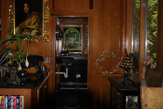
The back of the library is separated from the office area by a tall closet with monkwood louvered doors attached to a low closet
topped with granite to match the apothecary cabinet granite. The entry into the bathroom lies between the low closet and the back windows.
The painting hangs from a picture rail near the ceiling on a wall of poplar panels. Over the door can be seen more detailed
poplar. The finishing at this point, for both panels and poplar, has been fairly complicated. A base
of polyurethane keeps the grain intact, with the color obtained by a combination of Cabot pecan stain and
Cabot pecan polystain. They're all finished in multiple layers of polyurethane.
A pocket door of solid birch opens into the bathroom.
The bathroom sink is a half sphere of black granite with a rough exterior. It sits as a vessel on an incredibly small poplar panel
which doesn't extend past the drain of the sink. As can be seen, the floating skirt is yet to be finished. A multi-angled edge to the
poplar will support narrow, vertical strips of multicolored poplar, banded by
walnut at the top and bottom edges. It will all be supported on the wall, to maintain an impression of floating, and will be removable
for ease of maintainance.
By using a stained glass panel approximately the size of the bathroom window, privacy can be obtained without the use of shades.
The first picture in this section was taken while the nightblooming cereus was in bloom. This strange plant will periodically flower with huge blossoms that
open from around 8-9pm and last until 3-4am that same night. From the time when it is fully open, to the time it begins to close, the
sweet fragrance is overwhelming. When the upper picture was taken, five flowers had opened and the scent can't even be imagined. The lower
picture was taken later that day when the flowers had closed and all scent was gone.
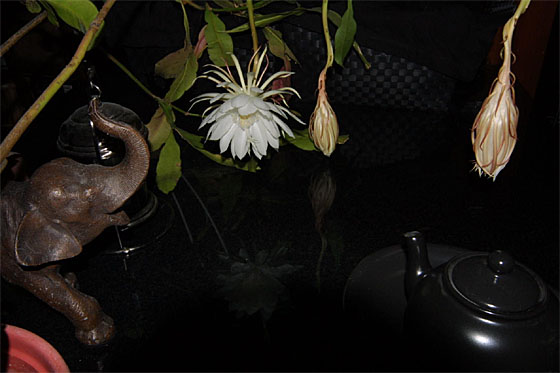
The next day a single flower opened.
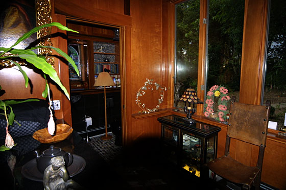
 The First Deer in Our Backyard
 Baby Raccoon Out Library Window
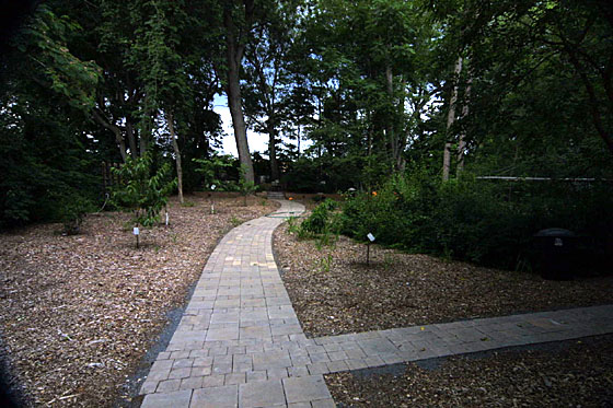
View out Back Left Library Window
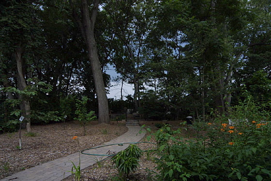
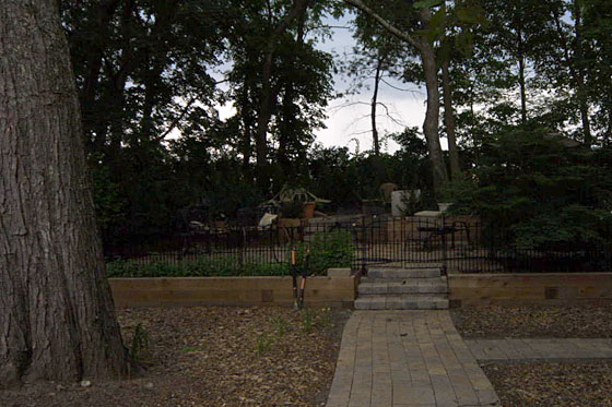
Paul and I are more indoors people than outdoors, so we tend to use our yard as a large painting seen through windows. Until
we finished the library, there was no reason to finish the yard behind it. But once we had settled in, the painting obviously needed
cleaning. Our landscaper is Trevor Newton, an absolutely brilliant young man. His parents own a nursery, so he was trained up young.
Over 30 years ago I had water pipes and electricity lines run out from the house to the left back corner of the property which I had
had bulldozed into two terrace levels. For 30 years it all just sat and waited. But once the library remodeling began, we started
turning that 30 year old dream into reality. Trevor removed trees and recovered the terraces from the undergrowth. Then he built
two stone terraces, each one bolstered by lumber walls enclosing planting areas. The lower level gardens are mint to the left and
random with parsley to the right. I think of it as my tabuli garden. The garden on the upper level is a long run of holly plants
which stay green in the winter and will grow up to be a privacy hedge.
The upper level has a table area to the left and a dog walk area to the right. Because the whole garden is enclosed with a tight
fence, the dogs can be left inside while I'm working in the rear. The lower level are seating areas. Around the back and the left
of the terraces are arbor vitae planted close enough together to form a privacy hedge. The result is a large area which still
feels very private.
Once Trevor finished the terraces, he began connecting the back of the house patio, the formal circle patio, a screen house patio
and the terraces with curving stone walkways. All plant material was removed so that the look is of brown woodchips rather than
grass. Turns out it was partly the fact that the yard was so green that kept Paul out of it. Now that he can walk through open
areas on stones, he's a lot happier to come out back with me.
|
| BATHROOM |
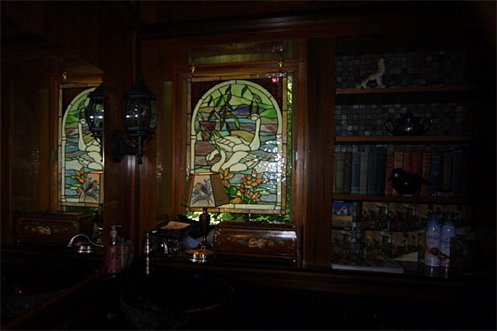
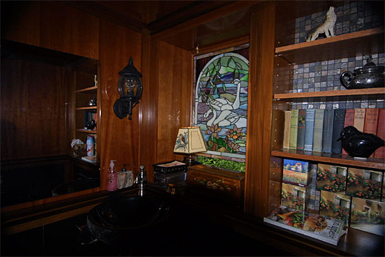
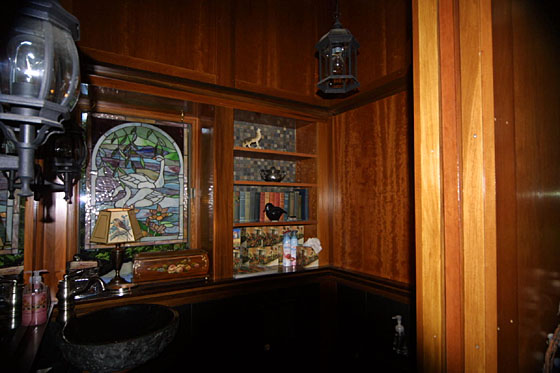
I tend to use the smallest areas for the highest quality materials, so the bathroom walls are cherry plywood above the sink, with
poplar and walnut trim, and black granite tiles below. Because cherry darkens in light, I wanted to affect the color direction
in which it darkened, so I put on a thin layer of cherry gel stain. The staining barely showed, and my grain was still intact (cherry
is another wood that will smudge when simply stained), so the question was how to get the color to deepen uniformly. The solution was
to take the panels outside and let them sit directly in the sun.
But since I was going to do this when the carpenters were working
somewhere else for the week, the panels had to be of a manageable size and weight for me to handle alone. That meant rethinking the
bathroom wall layout to include a narrow shelf running all around the room above the window. The sun cooperated, and I spent 5 days
moving panels throughout the day to follow the sunshine in the front yard, which has a southern exposure. This had to have looked very strange
for people passing by. But it worked like a charm. As an added bonus, the ledges served to visually shorten the uncomfortably high 10' walls
in the small space.
Since one of the goals in the library was to blend spaces, the design included a bumpout of library shelves and window, and outdoor lanterns
to repeat the ones around the French doors.
Most of the darker wood in the bathroom is actually walnut, rather than the darker poplar which is frequently
used for accent. The wood was milled and traditionally finished with tung oil and a single coat of
orange shellac. After that, the wood was repeatedly coated with polyurethane to make a smooth surface of
a very open-grained wood. Within the shelves, there is frequently an alternation of walnut and poplar.
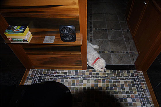
The wall beside the door is made from full poplar boards rather than from plywood. This is the only place where a thin coat of gel stain
was added to the pecan stain of the boards in order to bring the color closer to the cherry walls.
The floor of the bathroom is composed of 2"x2" stone tiles with a
narrow 3 tile border of 2x1 tiles. The 2x2's repeat as the frame of grey floor tiles in the back area of the library.
The tile shape is a repetition of the office wall of vertical rectangles and
borders. In this case, it's six 12" tiles (2x3) bordered by 2" multicolored stones.
That's Toby waiting patiently for the picture taking to be finished.
|
| BACK WALL |
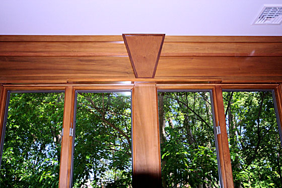
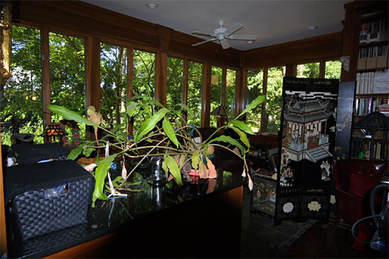
The span of this wall is 16'. Though fir was available in that width, I really wanted poplar, so we decided to
break the wall naturally with a keystone. The dark border is oak surrounding the lighter pecan birch
plywood of the keystone.
This detail shows you the multiple boards and battens from which the small bathroom wall was taken.
Harder to see is a shelf that goes across the width of the window wall, just above the windows. To break
the shelf, the shelf comes out wider over two pieces of window, the right part of one and the left part
of the next. The purpose is to emphasize that there are no window frames on this wall of windows. There are
only horizontals and verticals, with the windows becoming decorative elements. This jog is repeated with the front
French doors, and also in the floor design in front of the armoir.

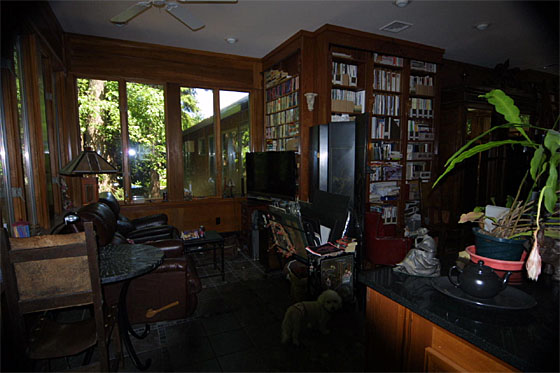
The room has a strange jog here because the 10' high wall is shared on the other side of the bookcase
wall by the basement stairs and the long closet in the pool room. Because of this, the TV area gets more privacy
from the front windows.
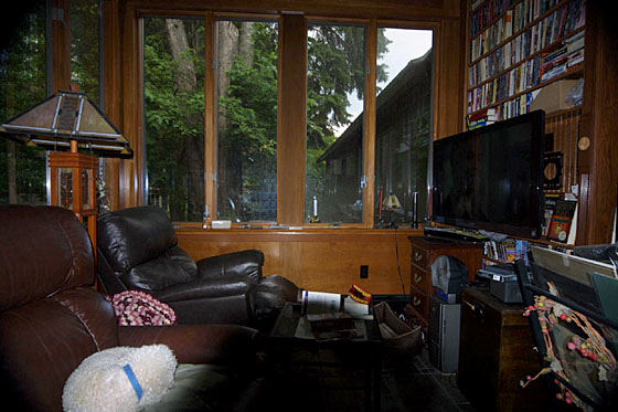
To the right in this picture is a bookcase facing the chairs. That forms an outside corner with the bookcase/armoire
wall that began this room tour. Note that the verticals between the windows go down to the floor, where they're ended with a small pediment
design.
Henry is the Bichon sleeping peacefully on Paul's chair.
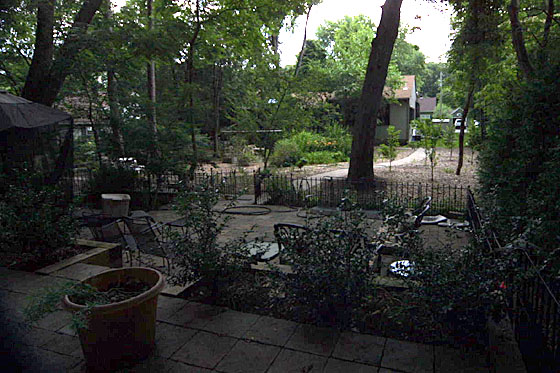
Library Seen From Upper Terrace
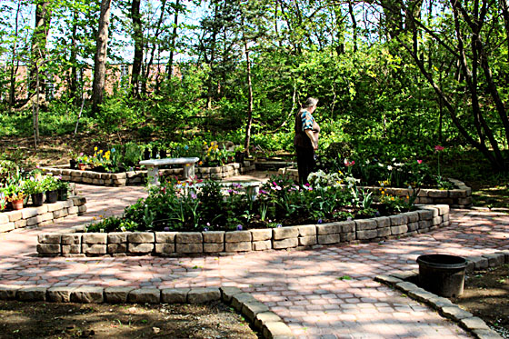
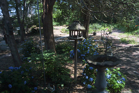
View out Bedroom Window
The formal circle behind the bedroom was Trevor's first patio, and he did it with surveying tools so that every stone
was laid perfectly. Consider me awed. The design had been there since 1976, but ringed in stones mailed back from my trips around the country.
The circle picture was taken while some of the potted
plants were still to be planted. It's fairly lush now. The brick path to this garden is a curve
of bricks with circles along the way. It comes out of the original brick patio at the back of the older part of the house.
This view is best seen from the bedroom window over a garden of hydrangas.
|


