When I first got into genealogy, I was expecting to find only a few ancestors. After all, nana's
background was confusing, to say the least, and father's father was pure mystery. As it turned out,
I needn't have worried. My worry, instead, became how to keep all of my father's mother's family straight.
Too many dates! Too many facts! My brain was roiling. Every genealogy layout I knew just overwhelmed me.
That's when I decided to design my own approach to genealogy forms - to find the layout that was most natural
for me to understand. I'm a visual person, and I'd worked in multimedia design at IBM
Research, so something that emphasized images, rather than just dates, was what I needed.
What I came up with is something I call a MultiMedia Family Form. I call it that because I used to work
for defense contractors, who abbreviate and pronounce everything, and mmmmfffffs sounded perfect.
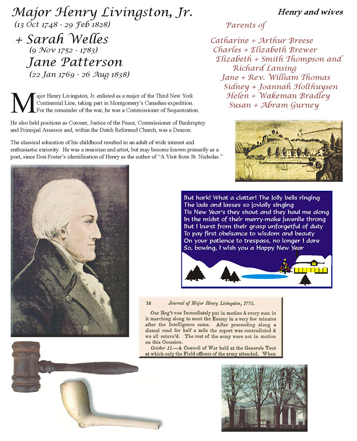
A MMFF covers at least a couple, and may cover their children. The couple's name and dates is at top left.
Their relationship to me is at top right. Below our relationship, I put a small descendancy outline.
These don't have to be complete. They just need to remind me how I connect to them.
Grandfather of a recognizable immigrant ancestor, for example.
The rest of the page consists of a textual description, surrounded by images that remind
me of aspects of their lives. This means I can glance at a MMFF and instantly connect names to our
relationship, and remember who they are by images rather than words.
I then file the MMFFs in notebooks by generation.
There's another reason I use MMFFs. They bring the person alive for me. They're not a box
on a graph, or a line in a list. They're people, who lived and loved and breathed and who share my
blood. I want them to
live again. Emphasizing individuals in MMFFs does that for me. It might do that for you, too.


